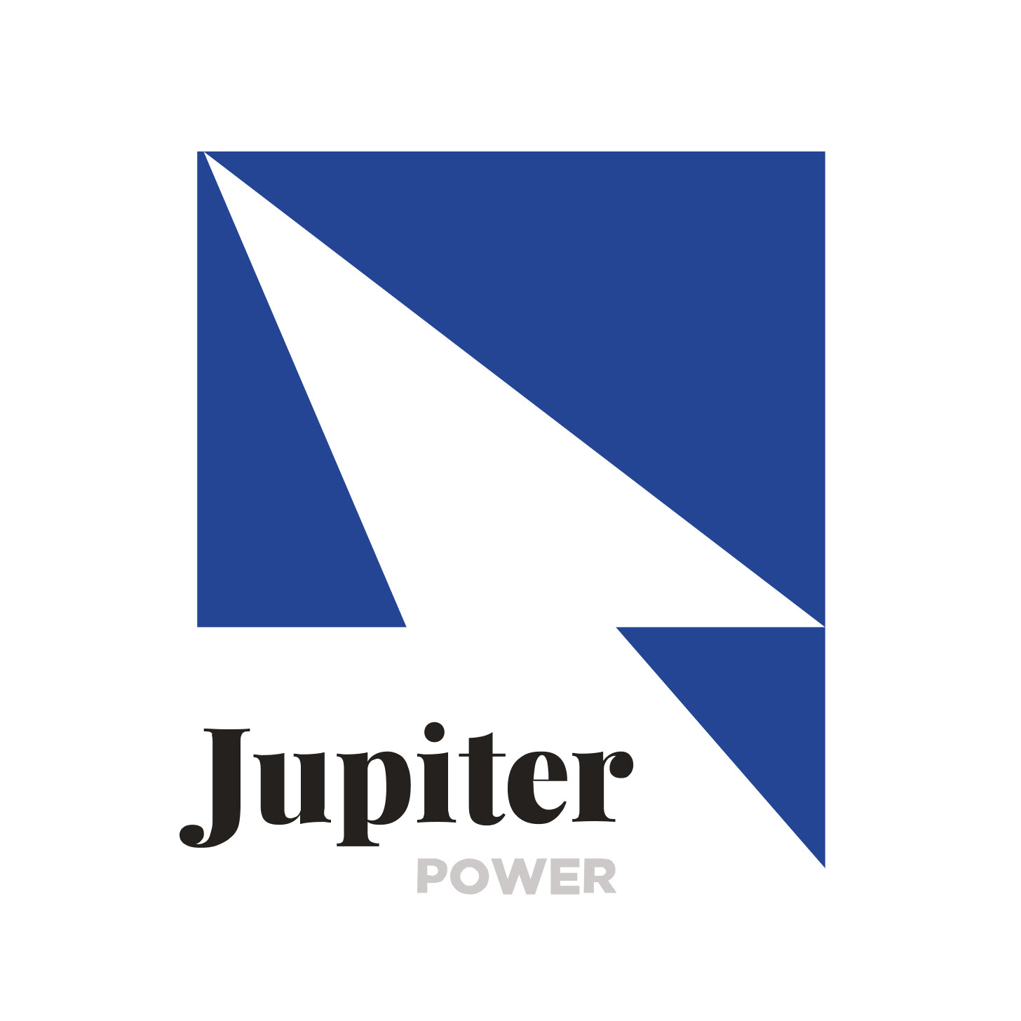
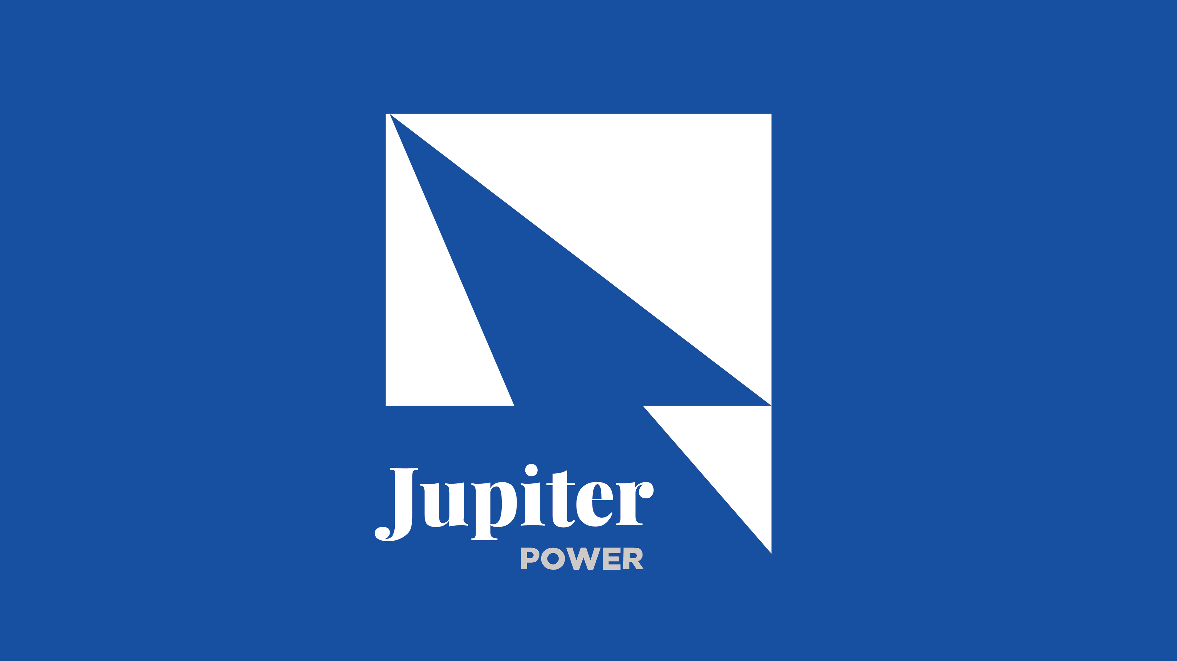
Jupiter Power was ready to shake up the energy storage world.
Backed by Encap Investments LP, they felt confident in their rock-star team & sure of their solution.
Now all they needed was a brand that communicated this confidence upon launch—and most importantly that could signal why their approach to storage was differentiated + revolutionary.
Thus, they called on my team to visualize an identity from the ground-up—messaging, logos, socials, digital presence, print collateral—everything needed to ensure their debut would be a running start that would resonate, reverberate.

THE ITERATIVE PROCESS:
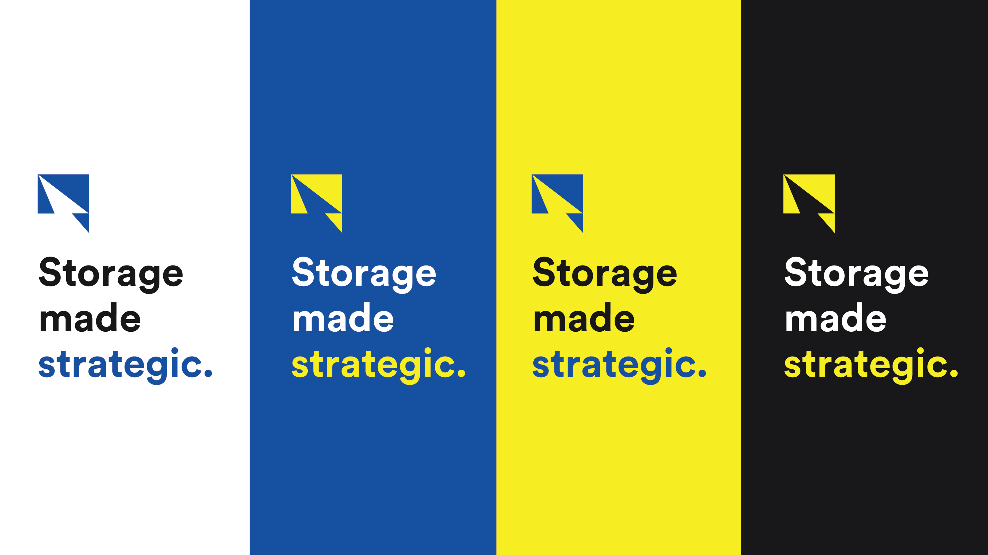
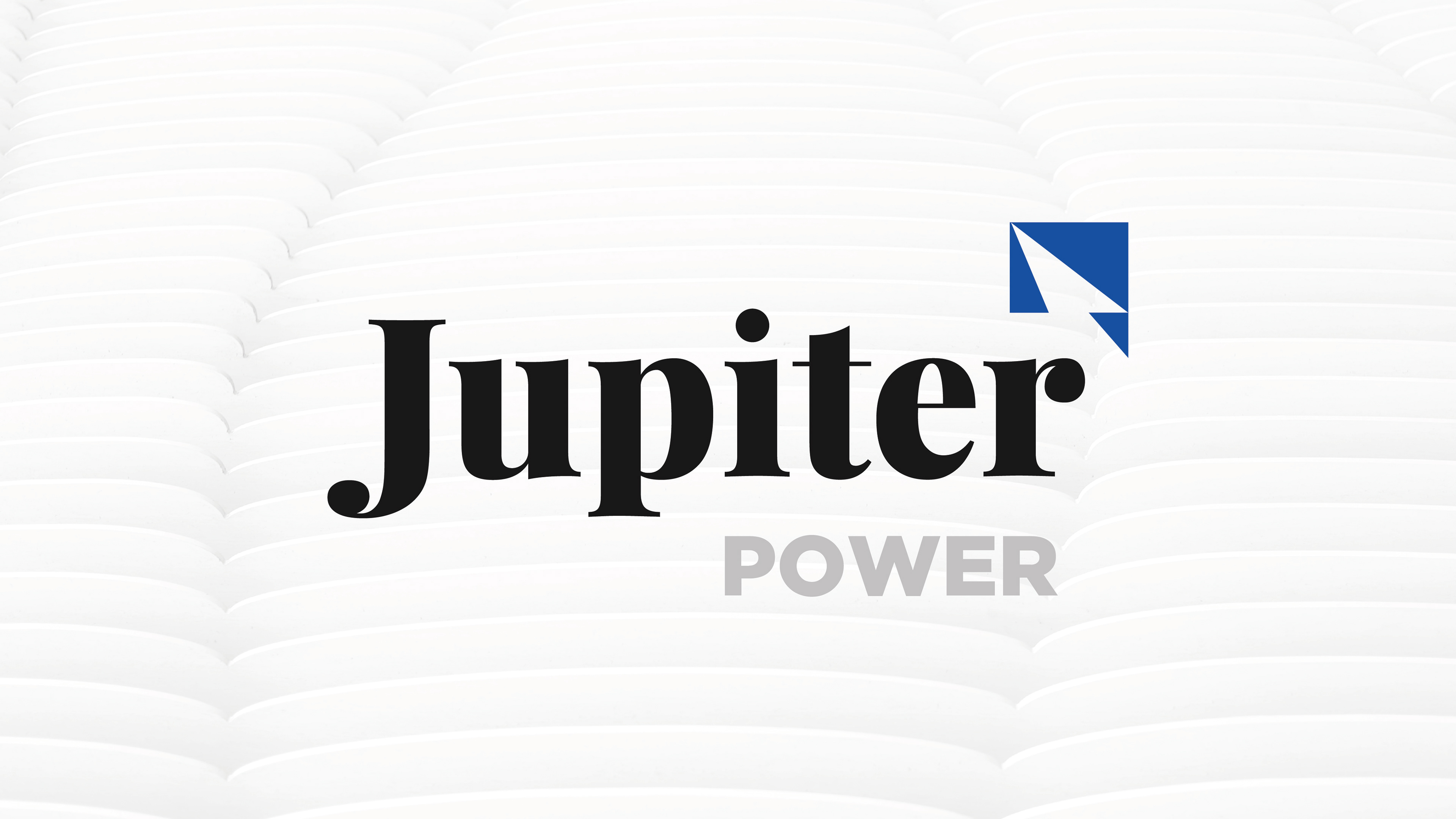
VISUALIZING MESSAGE
VISUALIZING MESSAGE
As we explored logos that resonated with "Jupiter Power", messaging that spoke to their storage strategy began to formulate from the back and forth iterative process.
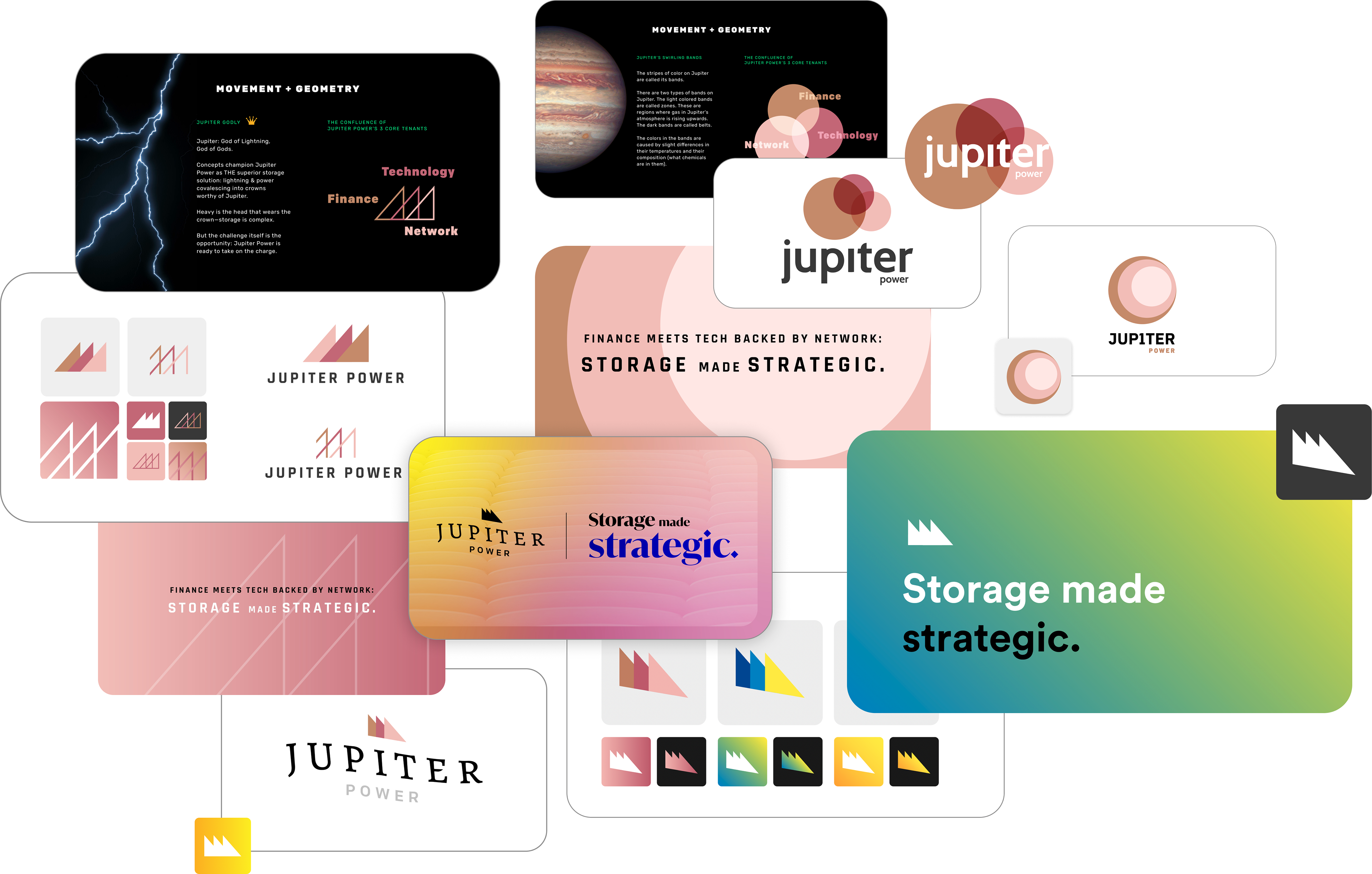
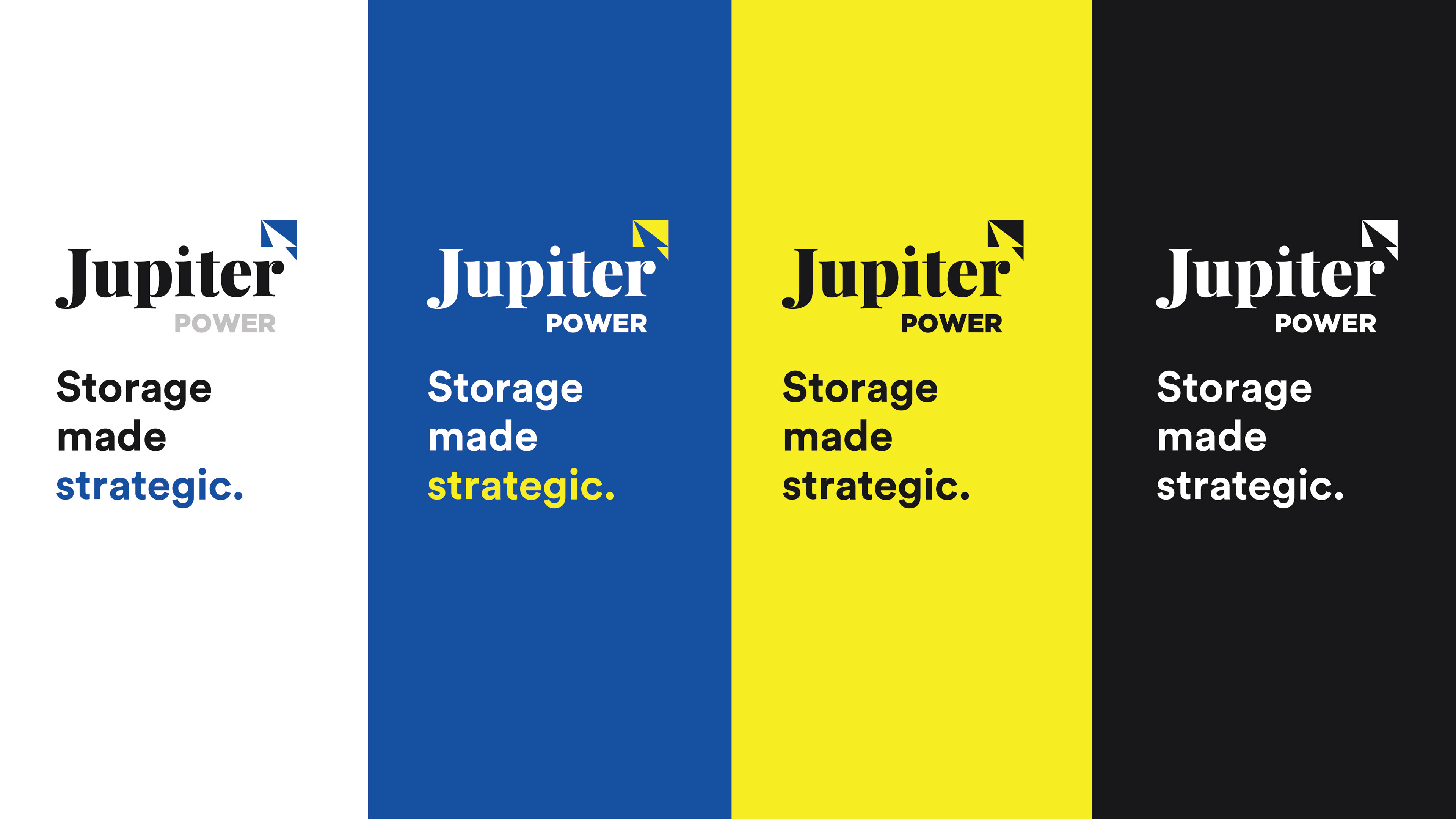
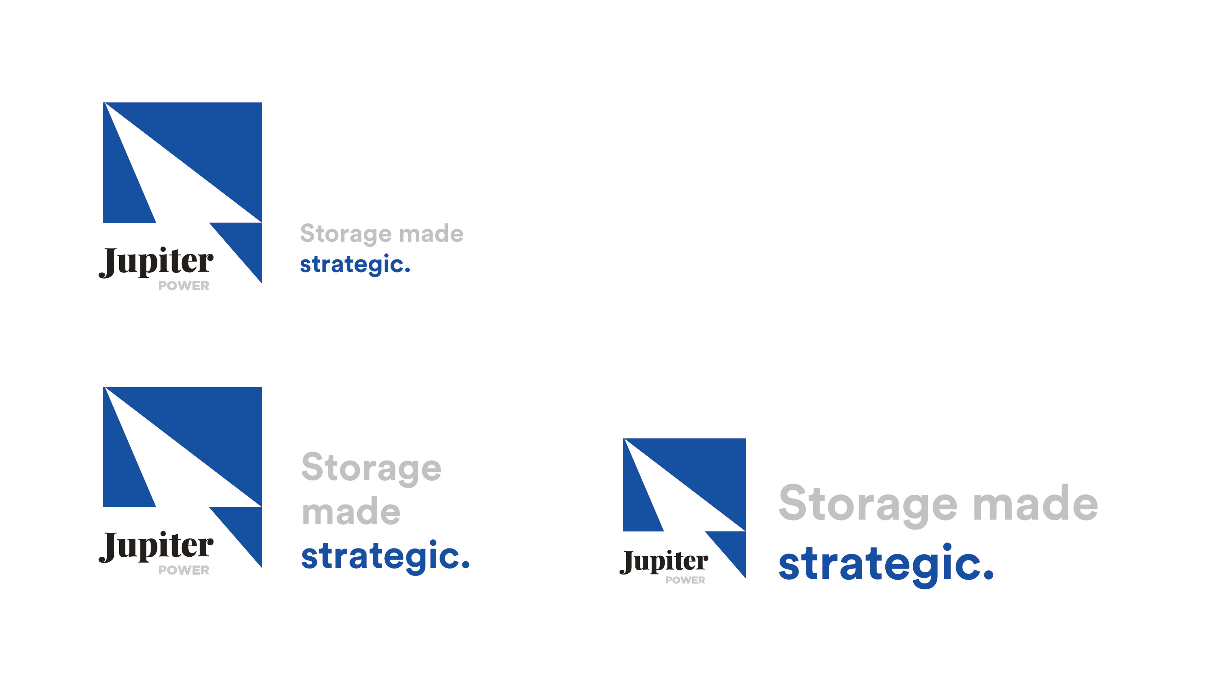
FINALIZING BRAND:
FLESHING OUT THE BRAND
FLESHING OUT THE BRAND
Finalized brand + messaging fleshed out in parallel:


PRINT PRESENCE
STATE-SPECIFIC SALES COLLATERAL
STATE-SPECIFIC SALES COLLATERAL
Setting up replicable design systems for sales team mem to create brand-aligned one pagers to wow & inform
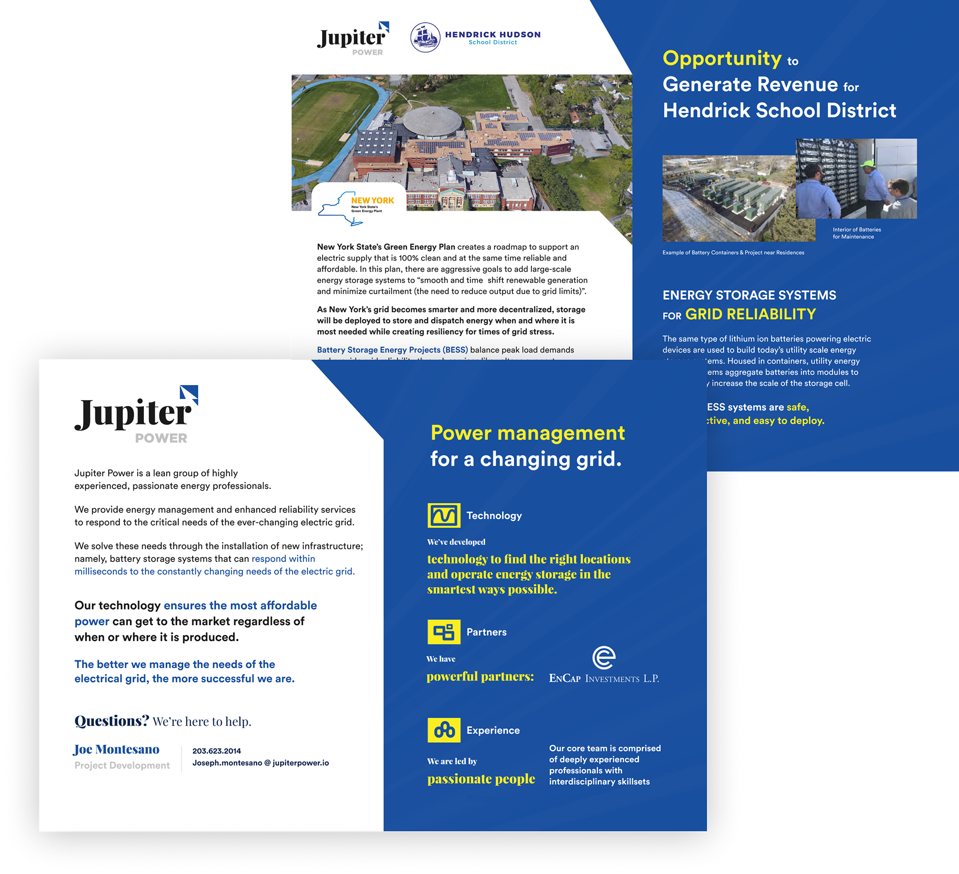
New York Sales Collateral
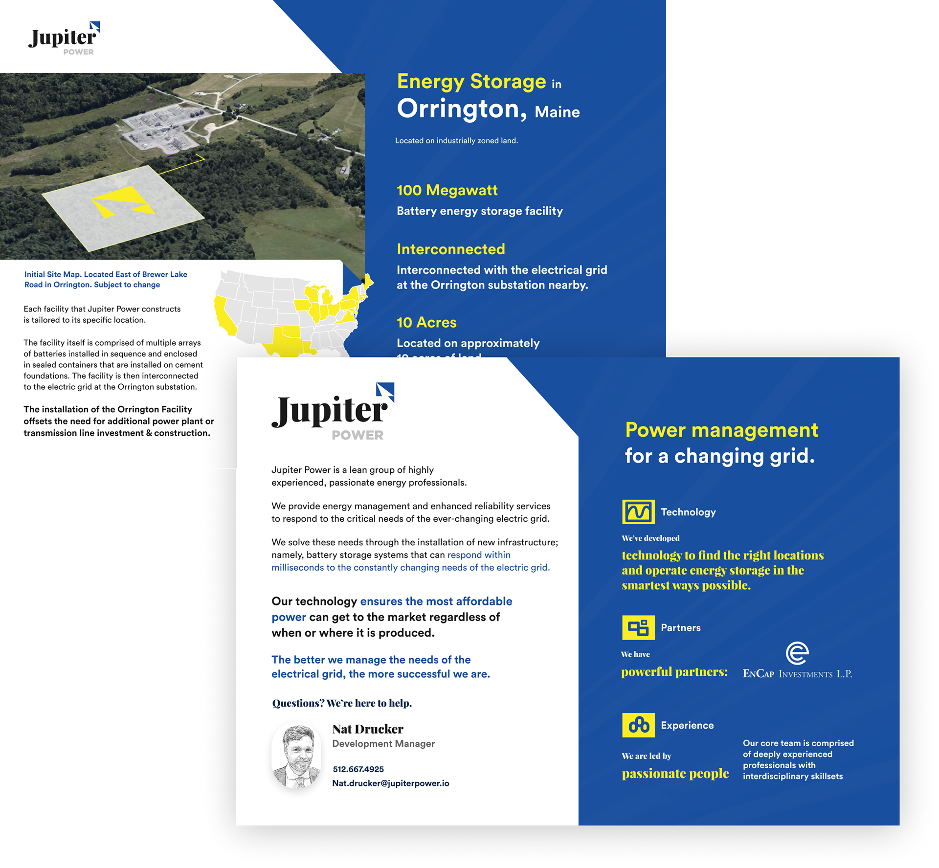
Maine Sales Collateral
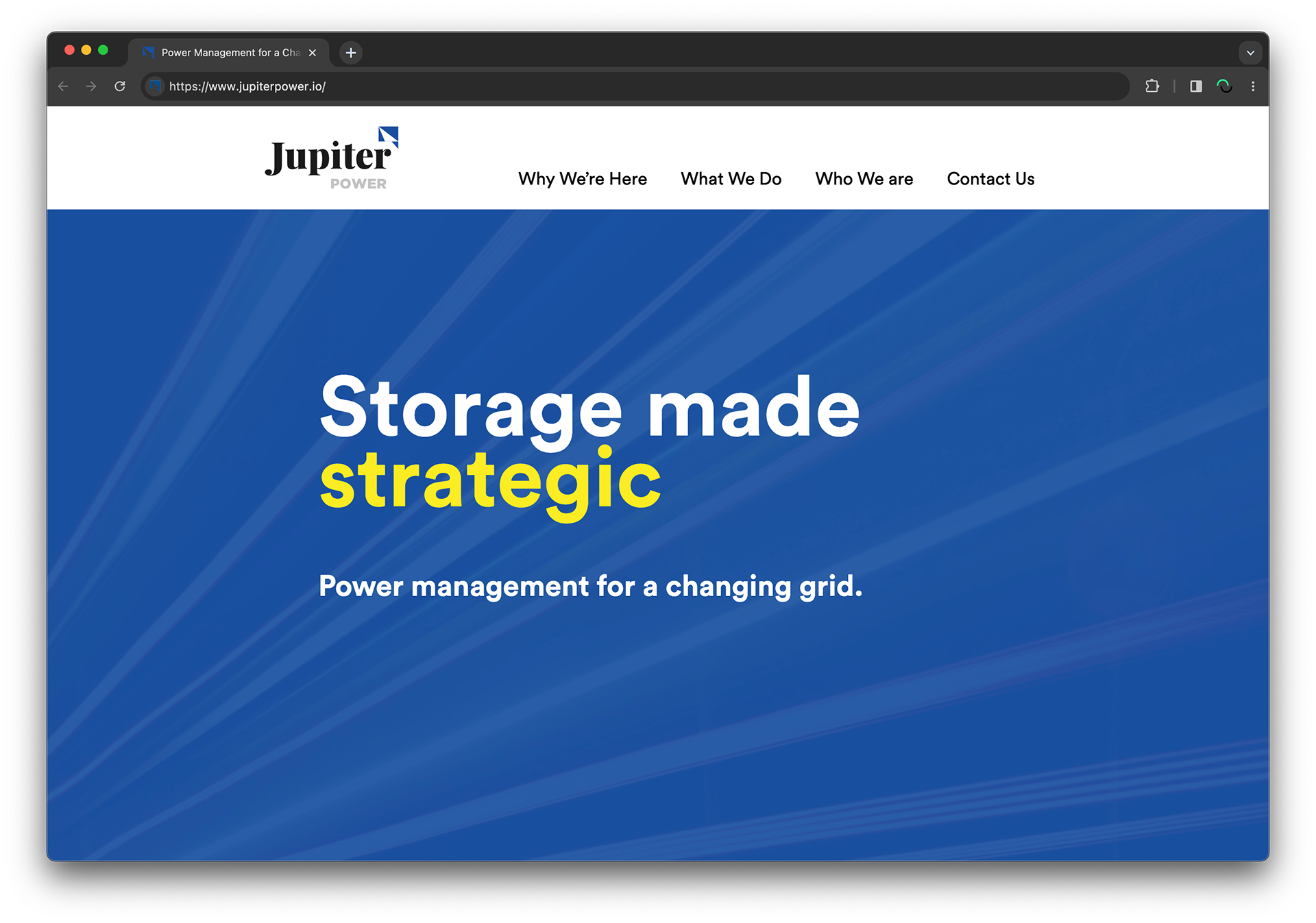
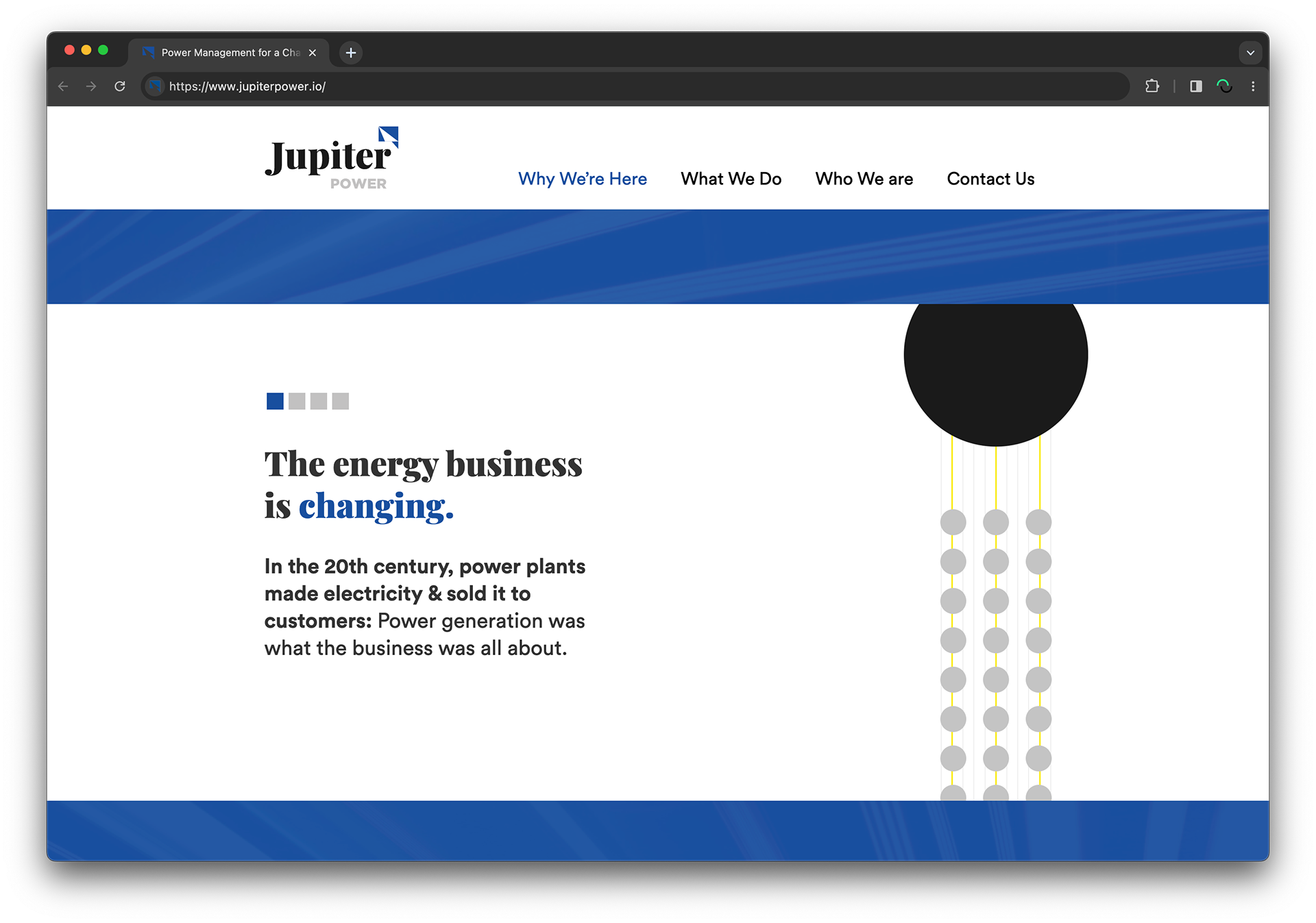
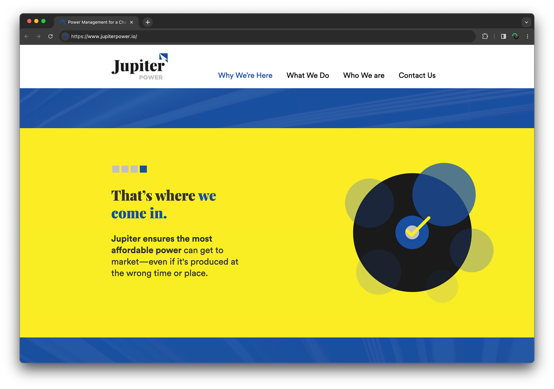
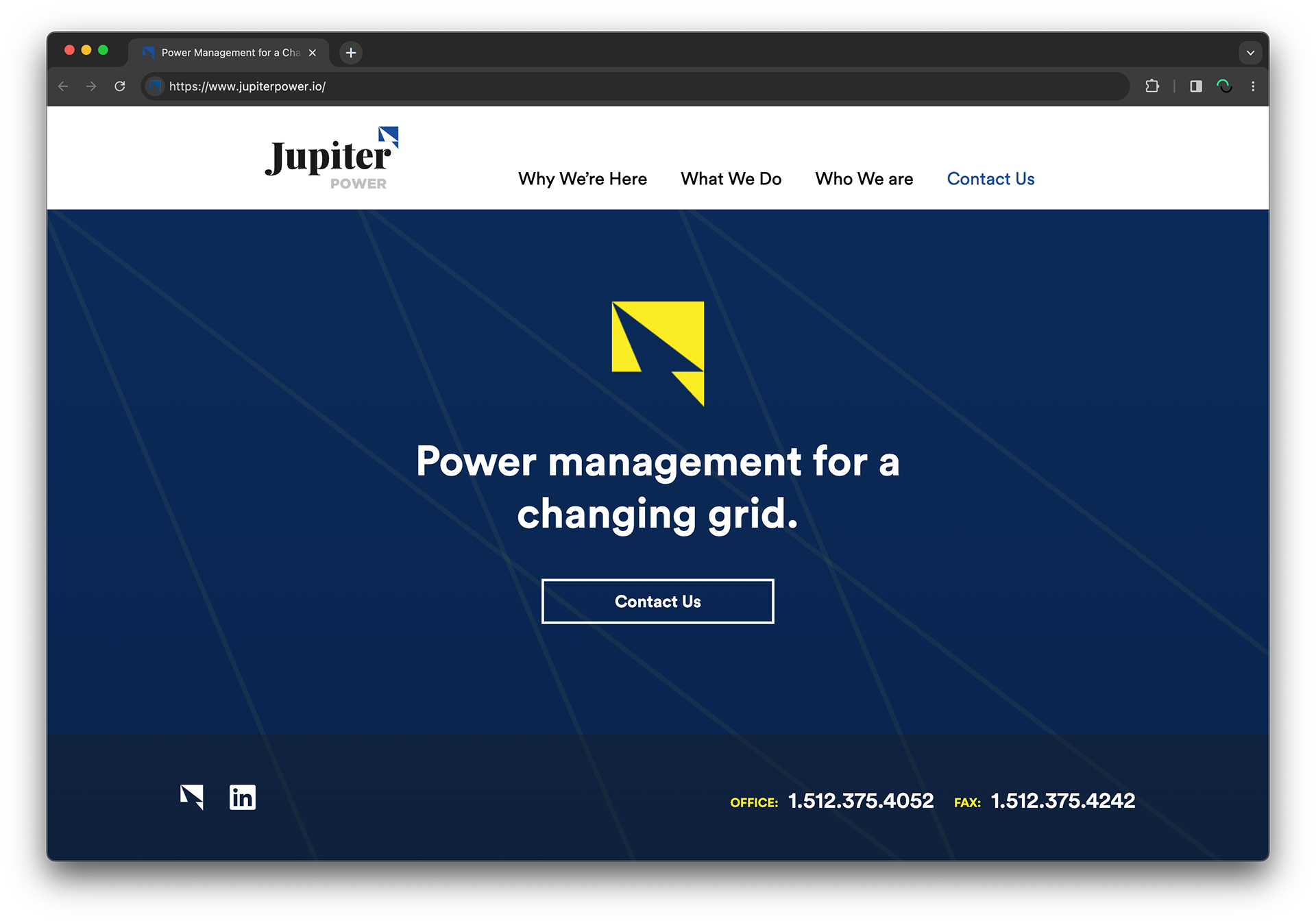
LANDING PAGE
INITIAL DIGITAL PRESENCE
INITIAL DIGITAL PRESENCE
A digital presence aligned with brand: